Voi Hyvin Honey Chocolate Bars


Background and Strategy
Voi Hyvin is Finland's largest organic honey producer. Last year the innovative company launched a new organic, fair trade chocolate bar filled with delicious creamed honey. The bars come in three honey filling options, the original creamed honey, honey mixed with lingonberries and honey mixed with blueberries.
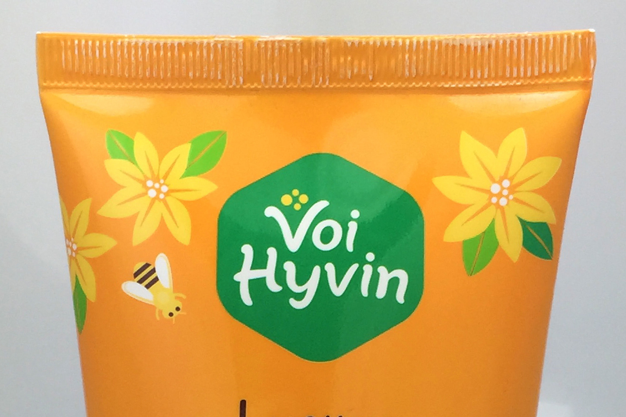
We wanted to design a packaging solution that builds on the brand's existing brand equity, especially its yellow color, while differentiating itself visually in the crowded chocolate bar aisle as the only "honey-filled" chocolate bars.
Packaging Design
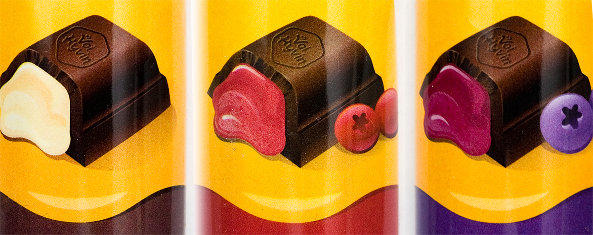
The honey dripping in the on the chocolate bar wrapper is used to create a repeating pattern across multiple bars within a shelf display box. The honey drip element is used as a brand unifier among the different flavored bars, a brand amplifier on store shelves (creating a larger "billboarding" effect when bars are placed side-by-side) and a key brand differentiator among other chocolate bars on store shelves. Each bar also contains a unique secondary color and illustration to help distinguish the family of flavor offerings.
Custom Illustration
The design also incorporates custom illustrations of the honey-filled chocolates to help clearly communicate this unique product to consumers. The above detail image shows the illustration as well as the design's billboarding effect created by the wavy honey pattern that flows from package to package.
Total Client Deliverables
Voi Hyvin's website design was part of a larger brand update. In total, we delivered
- Logo redesign and updated visual identity
- Packaging design for Voi Hyvin Honey Chocolate Bars
- Packaging design for Voi Hyvin Honey Squeeze Tube
- Packaging design for Voi Hyvin Honey Paper Tub
- Custom product illustration
- Website design
- Point of purchase sale signage