Vellore Christian Medical College Foundation Logo and Visual Identity Design
Background and Strategy
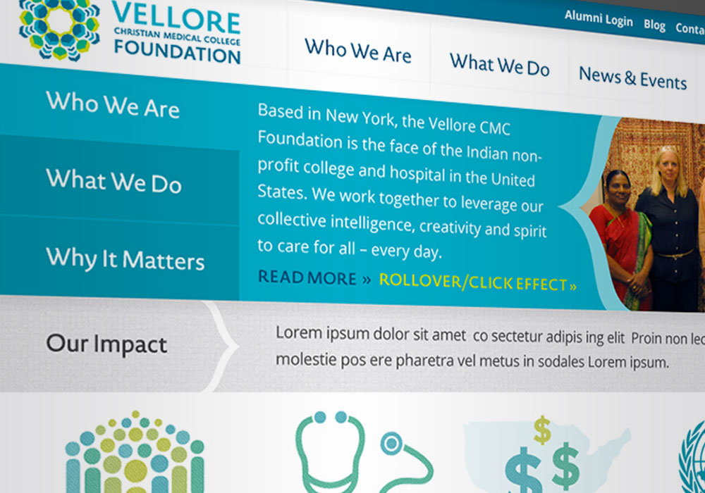
Based in New York, Vellore Christian Medical College Foundation is the North American arm of the #1 private medical college and hospital in Vellore, India. The Foundation’s branding and communications platforms did not reflect their valuable work or the powerful story of the college and hospital in Vellore. With so many world health organizations, educational institutions, research centers and public health programs, how would this one stand out?
Working with Smith and Co. Creative on brand strategy, we discovered that in the health space, everyone is a Florence Nightingale—that is to say, playing the archetypal role of Caregiver. The same is true for Vellore CMC and The Foundation—with an important twist. Going back to its powerful genesis story, we were deeply struck by the gumption, grit and grace of Dr. Ida Scudder who founded the organization in 1901. An American Christian missionary and one of the first women to graduate from Cornell Medical School, she traveled to India to start a one-bed clinic to tend to the throngs of women dying in childbirth (going untreated by male doctors because, according to Muslim and Hindu custom, only husbands could touch their wives). From a one-bed clinic to a nursing school to a sprawling world-class campus and hospital, the men and women of Christian Medical College were shattering perceived limitations, employing their passion, ingenuity and (dare we say) entrepreneurial spirit to find a way to care for ALL.
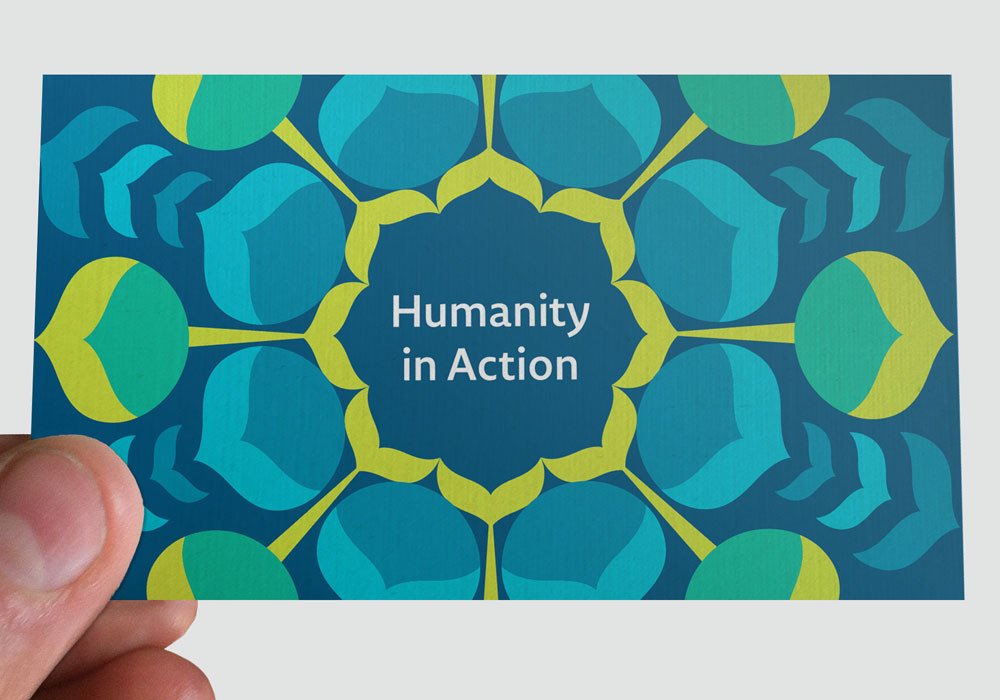
Through our work, we revealed that this organization is the Creative Caregiver, finding ways to reach and heal anyone, anywhere. To bring the highest quality care to the people who need it most. To create and share a new model for healthcare. Their promise: “Together, we’re leveraging our collective intelligence, creativity and spirit to care for all—every day.”
Logo & Visual Identity Design
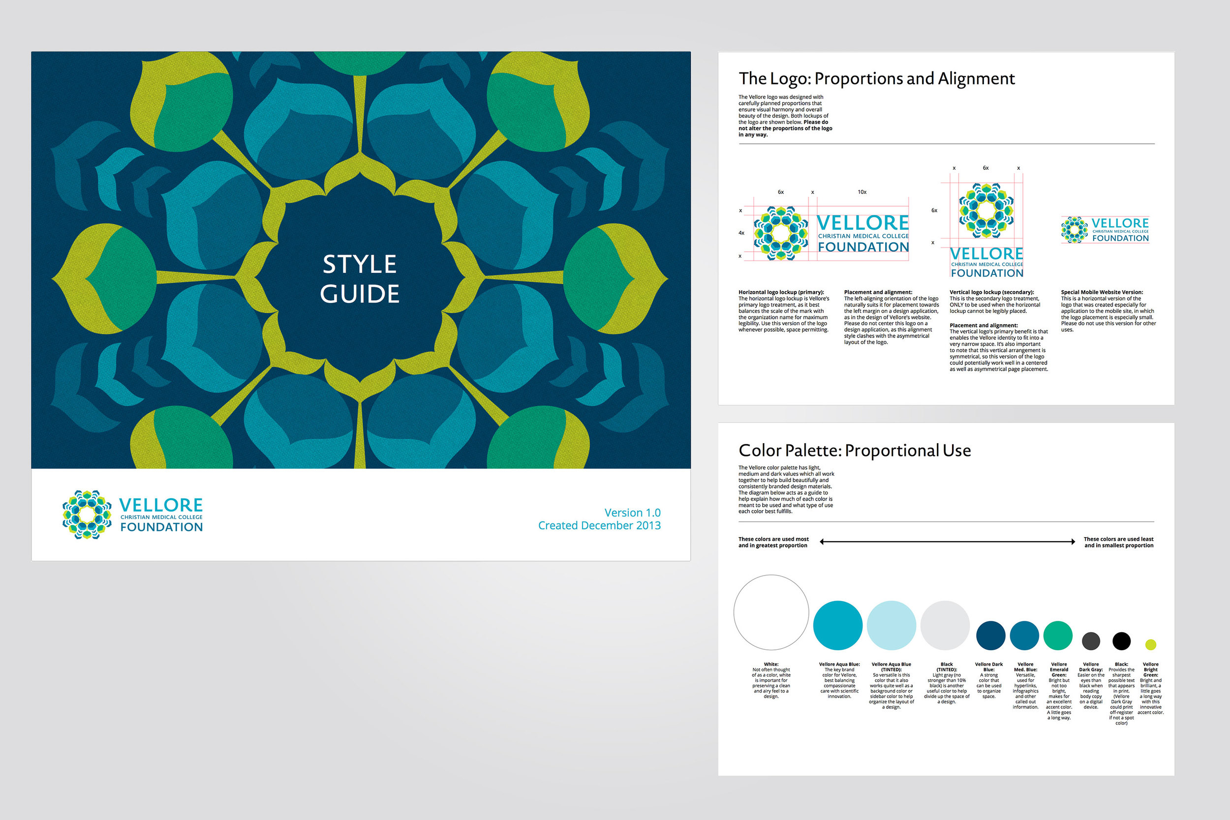
The Vellore logo focuses on CMC’s unique approach to health and healing, which begins with a caring, compassionate spirit of service that is further empowered by scientific research and rigor. In the joyful spirit of humanity in action, the logo’s colorful and joyful shapes reach outward to the world. The precision of the elements within the logo evoke an almost molecular quality that could be used to speak to research and scientific rigor. But at the heart is always a compassionate spirit heart to reach
out to the world.
The overall circular shape of the logo, paired with a blue-green color palette, makes a subtle reference to global outreach, while the individual shapes themselves were inspired by Indian design. These pointed shapes, whose form lends a sense of direction, power, and even warmth, were inspired from Indian architecture and even the feathers of India’s national bird, the peacock.
Total Scope of Deliverables
Collaborating with Smith and Co. Creative on brand strategy, messaging and tagline, and Andres the Giant on web development, we delivered:
- Brand Strategy and Messaging
- Tagline
- Logo and Visual Identity
- Collateral Design Recommendations
- Brand Style Guidelines
- Website Design and Development