Järki Särki Visual Identity
& Packaging Design
Background and Strategy
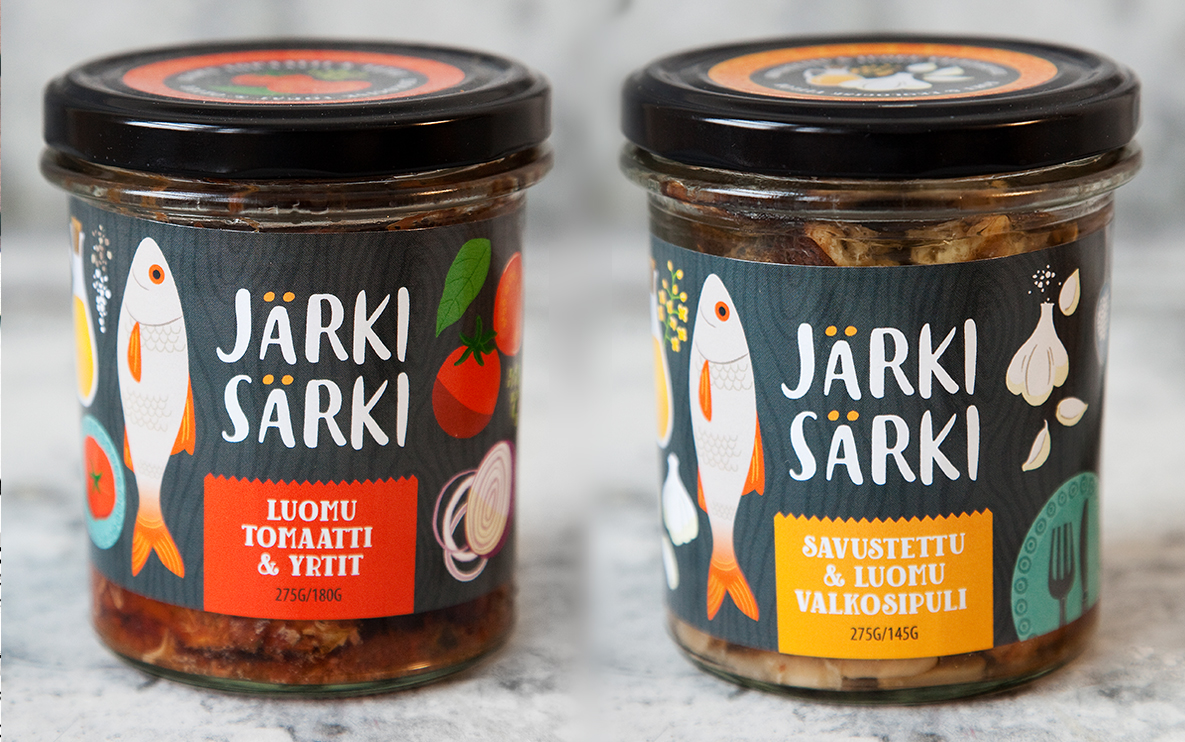
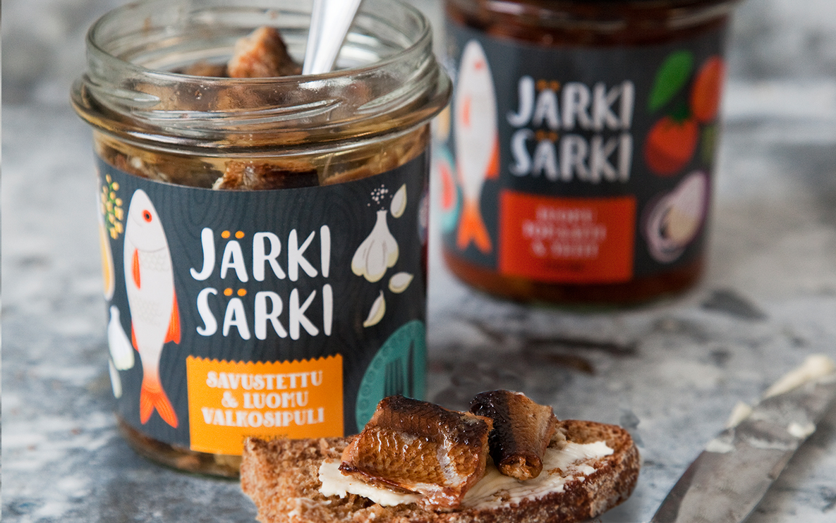
Järki Särki is a start-up organic Finnish food brand that produces seasoned and prepared fish. Rooted equally in sustainability and delicious convenience, this challenger brand harvests särki, a Finnish fish that is largely populous yet under appreciated in the marketplace. As a branding strategy, we wanted to focus on taste first while conveying the natural wholesomeness of the products. The brand launched this year with two jarred varieties: smoked särki seasoned with garlic and sea salt, and särki roasted with tomatoes and herbs.
Visual Identity and Packaging Design
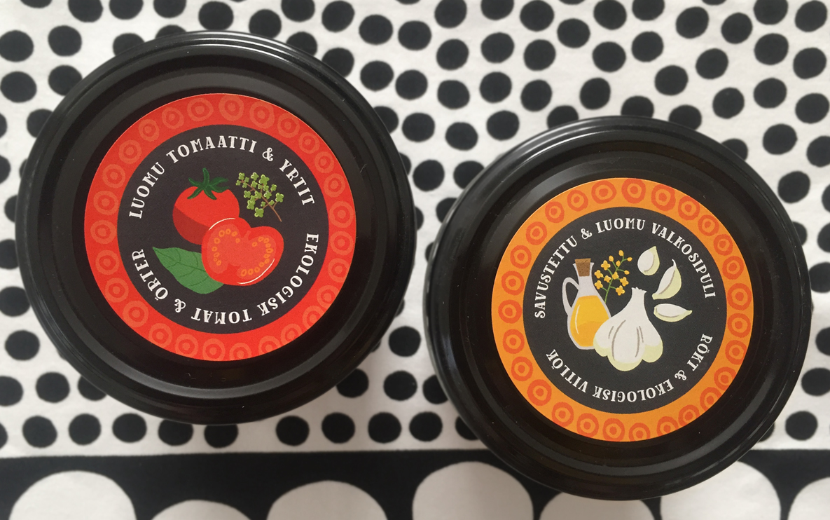
In a Finnish marketplace where canned fish is competitive and commonplace, we positioned Järki Särki in stark contrast to the competition. Starting with a glass jar instead of a traditional tin can enables customers to see the product for themselves, allowing us more leeway in the design. In contrast to other brands which showed photographs of icy lakes on their fish products, we chose an illustrated approach to warmly show the fish in a kitchen environment where the fish was paired beautifully with its accompanying ingredients. This representation of ingredients also tells the story of the healthy, natural simplicity of the products. All ingredients in the jar are illustrated on the label--no additives.
The food illustrations were inspired by vintage Finnish illustrations, which helped to add an authentic Finnish sensibility to the design without resolving to the more obvious Finnish flag or landscape. Warm accent colors, oranges and reds, were chosen to emphasize the delicious taste of the prepared products rather than the chilly blue waters from where they came.The quirky playfulness of the illustration also adds a modern aesthetic and an approachable sensibility, balancing the ideas of artisanal, premium quality with everyday use.
Total Scope of Deliverables
- Logo and visual identity
- Custom illustration
- Packaging design for both jarred fish varieties