Clarity Project Visual Identity
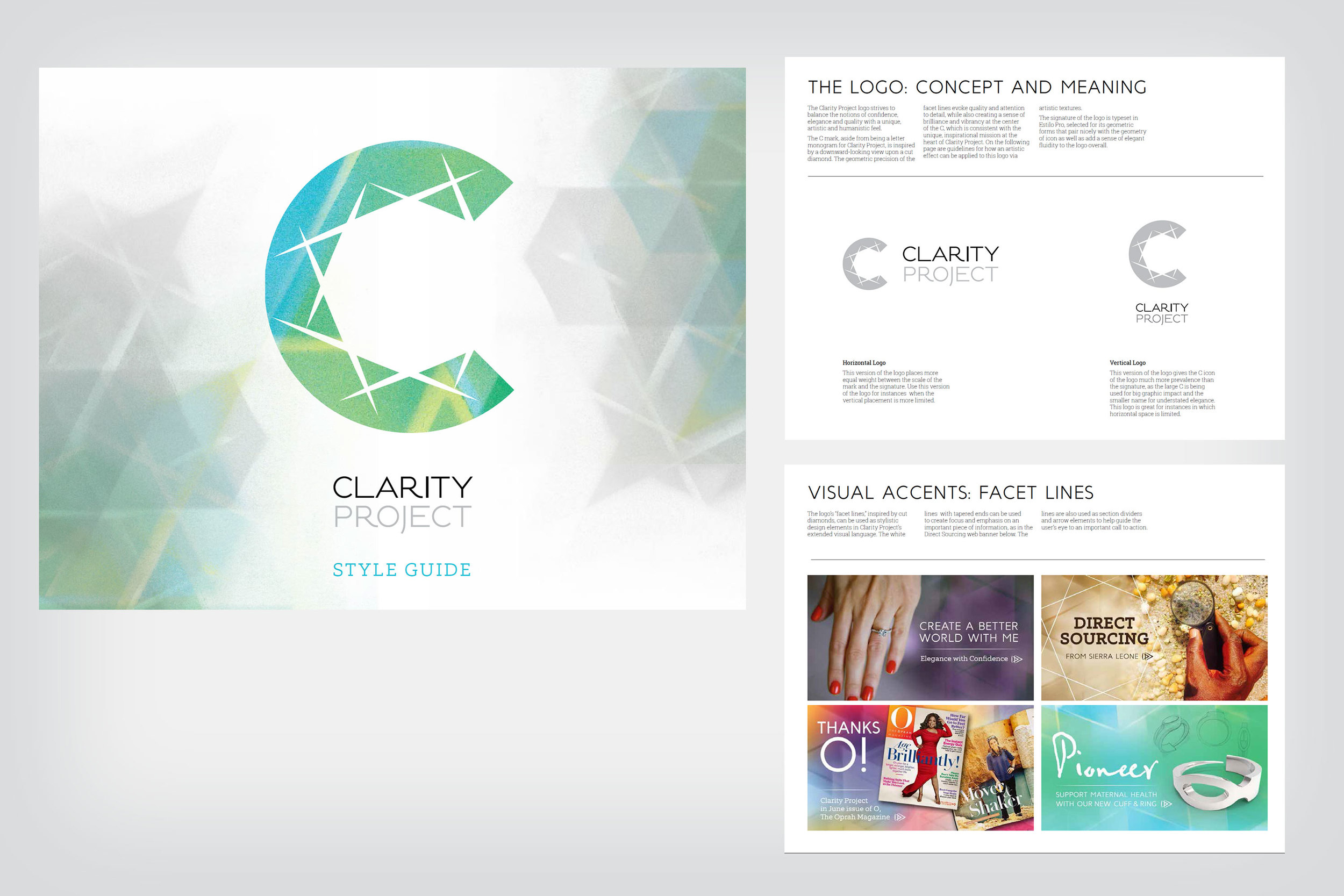
The Clarity Project logo strives to balance the notions of confidence, elegance and quality with a unique, artistic and humanistic feel. The C mark, aside from being a letter monogram for Clarity Project, is inspired by a downward-looking view upon a cut diamond. The geometric precision of the facet lines evoke quality and attention to detail, while also creating a sense of brilliance and vibrancy at the center of the C, which is consistent with the unique, inspirational mission at the heart of Clarity Project. On the following page are guidelines for how an artistic effect can be applied to this logo via artistic textures.