BeeKind Farms Packaging Design
Background and Strategy
Honey is the third most adulterated food in our marketplace, with an estimated 3/4 of honey sold in the United States is ultra filtered and no longer considered to be honey. With little government oversight to trace honey origins and processing methods, honey fraud continues to abound. In light of all of this, BeeKind Farms is a raw honey producer in the Connecticut and New York City area that is passionate about producing raw, traceable honey bee products. With so much public misinformation surrounding the origins and purity of honey, our goal was to use each jar to not only convey the premium quality and uniqueness of each honey variety, but to educate consumers about BeeKind Farm's self imposed high standards for traceability and to assure the sweet story behind each jar.
Logo Refresh
We began with a light refresh of the current logo to enhance the legibility and anatomically-correct structure of the iconic honey bee. As a brand that focuses on authenticity and accuracy, we wanted the bee to be not only beautiful and functional but true to nature.
Packaging Design
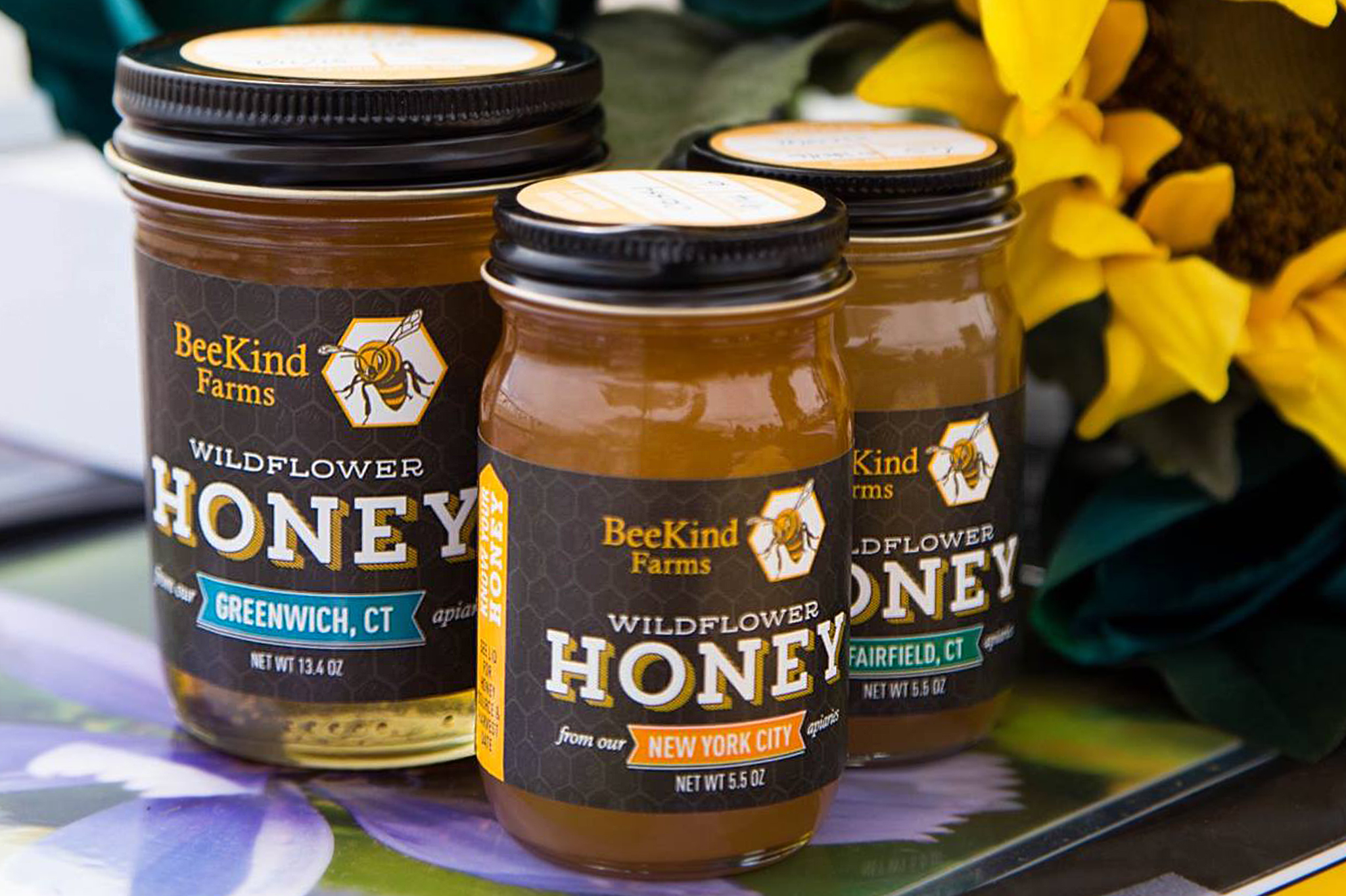
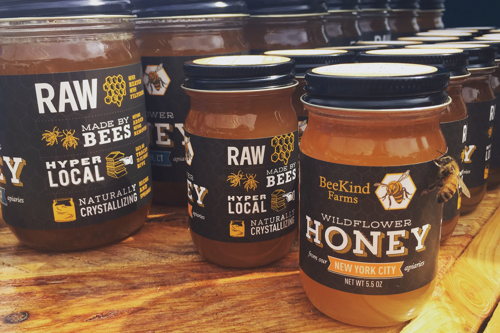
To evoke an artisanal feeling, the glass jars were selected for what feels like a fresh take on an American household classic, the ball jar. Each jar of honey is comprised of a two-label system. The front label provides a color coded flag to indicate the location of the specific apiary from where the honey was sourced. Key facts about the honey's quality are graphically portrayed on the side of the jar with etching-inspired illustrations and contrasting type faces.
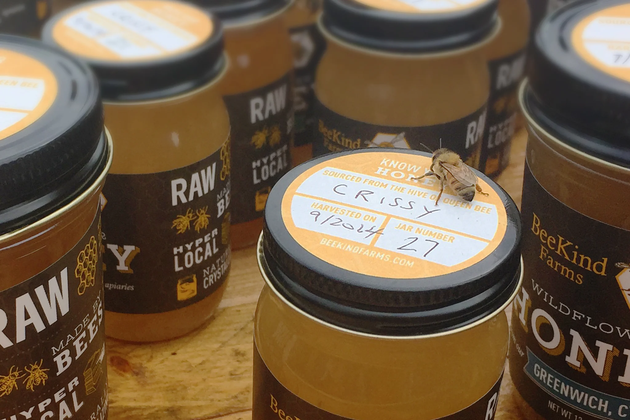
A graphic, yellow arrow with the phrase "Know Your Honey" points the user's eye to the lid of the jar, where specific, hand written information is provided about the honey's origins, including the name of the queen bee whose hive the honey was sourced from, the specific harvest date of the honey and the numbered jar in the each series. More information about each apiary will soon be provided on the BeeKind Farms website, providing customers an unprecedented amount of information relating to the traceability of their purchased honey.
Stylistically, we wanted the brand to feel artisanal, premium, a bit masculine and functionally suitable as a platform for sharing an array of knowledge in educating consumers. Our look was inspired by chalkboard art and Victorian advertising, known for its tendencies to elegantly make room for lots of information using contrasting lettering and type. The labels are printed with a matte flood finish for a craft-like look and feel, accented with areas of spot gloss to provide some pop and contrast to key elements of the design.
Total Scope of Deliverables
- Logo and visual identity
- Brand architecture
- Custom illustration
- Packaging design system of honey products